Airline On-Time Statistics and delays Causes from 2008

Analysis
PowerPoint
Presentation
Code
Design
Authors
Published

December 5, 2025

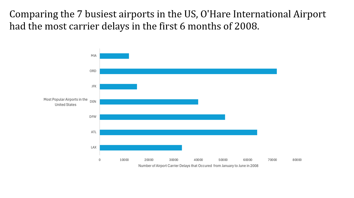
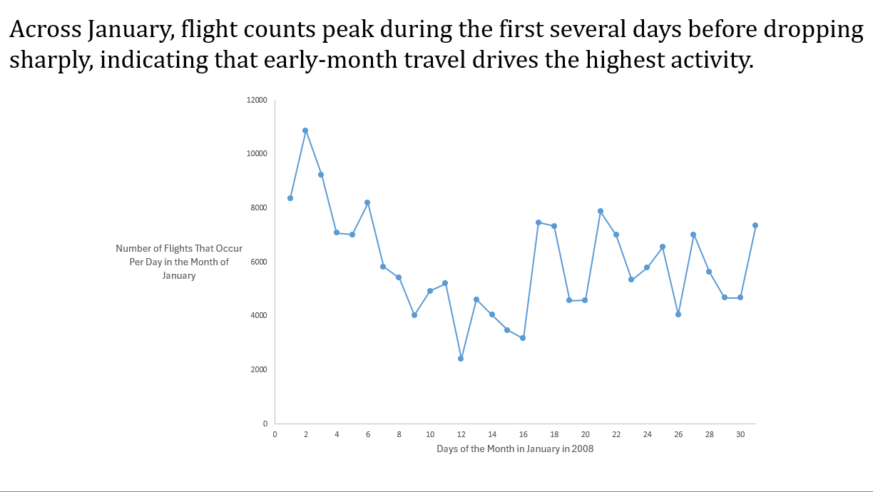
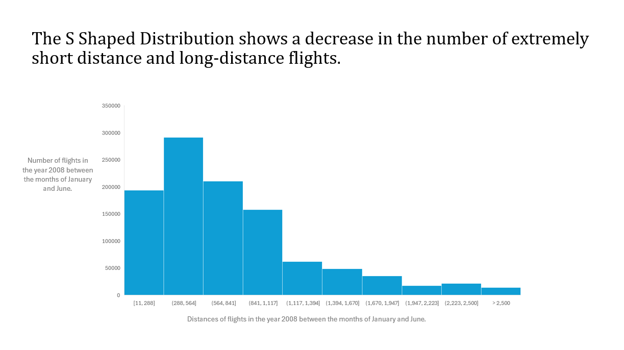
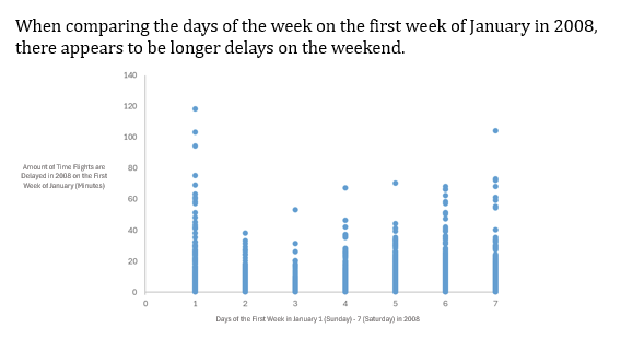
In the Fall 2025, semester I as well as three other group members conducted a group project where we took a public data set, analyzed it, and created four different visual representations of the data. Our public data set that we chose focused on flight records, specifically delay and departure/arrival times in the first six months of the year 2008. From this data, we were able to come up with four different questions that were able to be answered from our visual representations.

We wanted to understand whether certain airports experience carrier delays more often than others. We first reduced the data to the origin and the carrier delay, then we added a column that did an if-statement getting rid of the data if there was not a carrier delay. We then took the top 7 airports and did a count-if-statement that counted the amount of carrier delays at the top 7 busiest airports. Once we had all of that information, we then put it into a bar graph. We picked the bar graph because it compares the airports side by side giving us a better way to show the difference between them.

We wanted to see whether travel demand changed across the months such as spikes around holidays or weekends which can reveal patterns in the traveler behavior. Especially January being a very popular month of travel due to the holidays. We used excel by creating g a pivot table with “Days of the Month” as the tows and the values being the count of the number of flights per day. This gave us the total amount of flights per day in the month of January. We then used a time series to see whether or not the travel demand changes across the days of the month such as spikes in the earlier days of the month.

For this graph we are analyzing the Distribution of Flight Distances during the months of January and July in the year 2008. This question was particularly interesting to our group because many people in the airline industry could use this information to create more optimal flight routes based on distances. Our team used Excel to answer this question by creating a Histogram based on our data that we took from our original public data set. We then were able to see how many flights flew a certain distance and which bin they would be put into. We used Excel’s “recommended charts” function to create this graph. We also changed the color of the data in the graph from the normal “Microsoft Blue” to a different and more eye catching shade of blue. The last thing that we did to the graph was to minimize the amount of bins that we used in order to fit all of the labels horizontally. We did end up having to create the axis titles in the PowerPoint slide due to the fact that we could not rotate the vertical axis to make it horizontal.

We are testing whether there is a change in flight delat time based on the days of the week for the first month of January in 2008. We first created a new column naming it “Difference in Delay Prediction vs. Actual Delay”, to see the difference in delay time from predicted delay times according to the dataset. Creating a scatterplot we then decided to cut out all the negative value (flights that are earlier) to portray just the flights that were later than predicted. Lastly, we used the scatterplot to analyze which days of the week had longer and later delays and come up with our conclusion.